
Dalton & Turner – Barware Brand Creation
Dalton & Turner is a barware brand developed during my time at Captivate Brands. It was created to house the company’s entire barware offering under one cohesive, premium identity. The vision for the brand was to feel sophisticated, modern, and refined, appealing to customers seeking elevated home bar essentials.
I led the creative development of the brand identity, working closely with the wider team to ensure a consistent and premium look across all touchpoints, from packaging to product styling.

Logo Development
I was responsible for designing the Dalton & Turner logo, from initial concept through to final execution. The aim was to strike a balance between modernity and timelessness, resulting in a sleek monogram and clean typographic lockup that would resonate in both retail and e-commerce environments.
This section showcases the evolution of the logo, exploring various type treatments, monograms, and composition styles before landing on the final version.
Design skills used:
• Brand identity development
• Typography refinement and logo exploration
• Visual hierarchy and composition
• Concept presentation and refinement
• Typography refinement and logo exploration
• Visual hierarchy and composition
• Concept presentation and refinement
Packaging Design
In addition to leading the brand identity, I also set up a large portion of the packaging for Dalton & Turner. The packaging was designed to feel high-end while remaining cost-effective and functional across the product range. I primarily used backing cards and wraps, with a consistent black colour palette that helped unify the collection visually.
To elevate the look, we incorporated spot UV varnish, adding a subtle gloss contrast against the matte black base. This gave the packaging a refined, tactile finish that aligned perfectly with the brand’s premium positioning. Unfortunately, I do not have images of the packaging, but the structural design and material finish played a key role in the overall impact of the brand in-store.
Design skills used:
• Packaging layout and structural setup
• Material and finish specification (spot UV, matte)
• Cost-effective design for retail shelf presence
• Brand consistency across packaging components
• Material and finish specification (spot UV, matte)
• Cost-effective design for retail shelf presence
• Brand consistency across packaging components

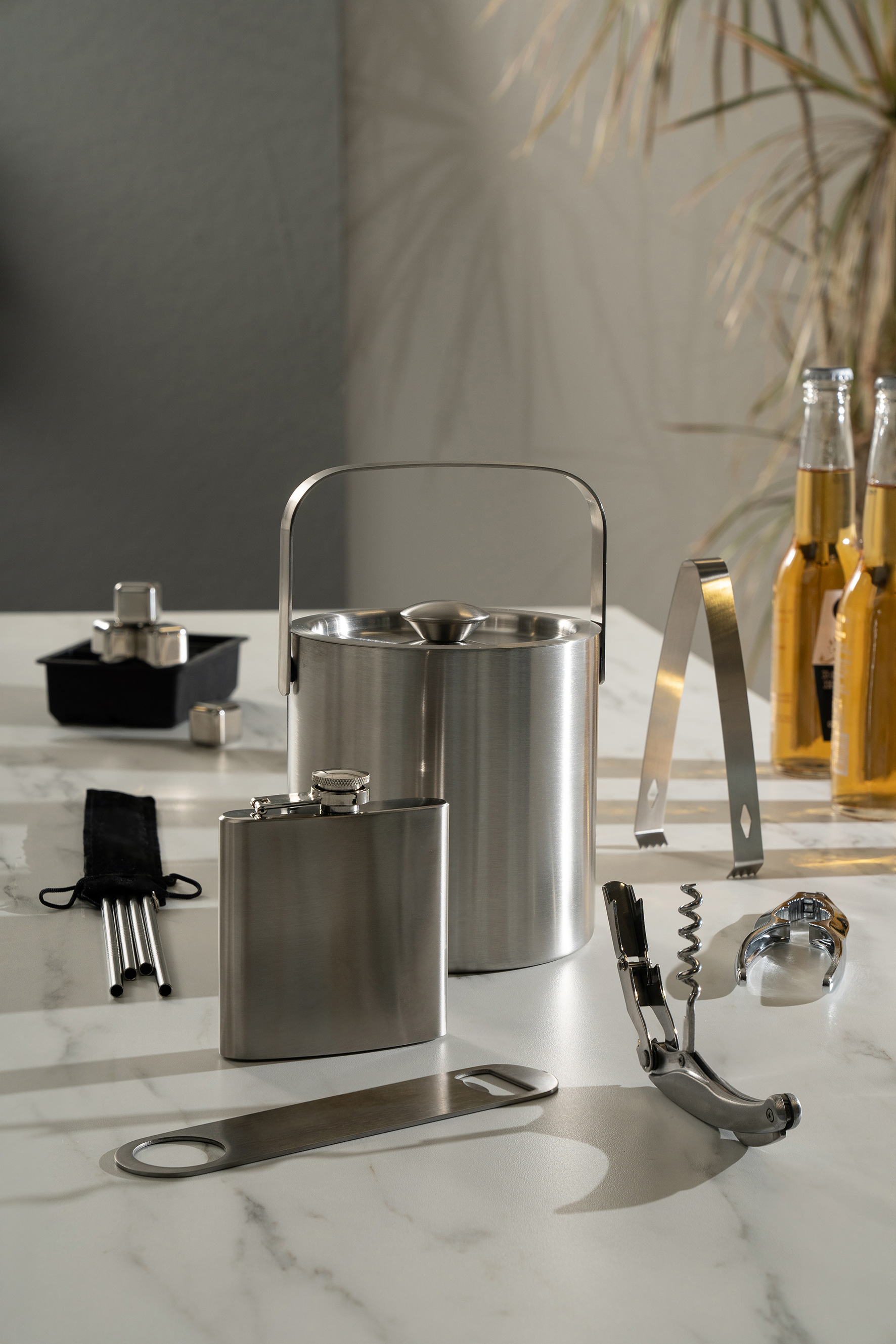
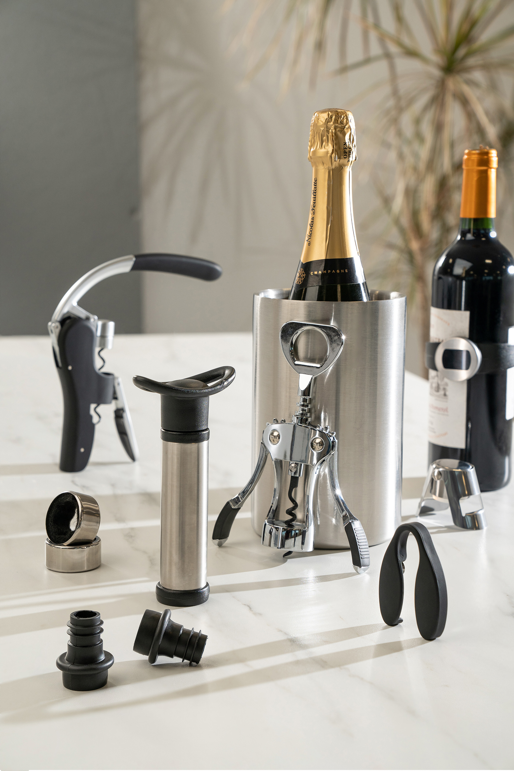
The Dalton & Turner branding was rolled out across a full suite of barware products including cocktail shakers, jiggers, corkscrews, flasks, and ice buckets. I worked with the product development team to ensure the brand identity was applied consistently across all items.
Monochrome palettes, brushed steel finishes, and clean silhouettes helped reinforce the brand’s refined and masculine aesthetic. This section highlights how the brand extended through product design and styling, even in the absence of packaging visuals.